Coffee overflows
What is the shade?
Think back to your morning cup of coffee, ordered from a friendly barista. The combination of rich milk foam and grains results in a delicate light tan or pastel brown. The hair will have approximately the same shimmer as it transitions to the corresponding subtone.
The tone will be better visible on light and brown hair.
Women with an initial tone of 6 to 10 can transform their appearance using this method: darker braids will not show all the charms, but very light braids can be darkened.
Representatives of any color type should pay attention to this coffee luxury from colorists: thanks to the harmonious distribution of pigments, the color cream composition combines warmth and cold, shine and dullness. It will look especially attractive with tanned skin and light hair.
Advice! Make your choice by purchasing special hairdressing strands to match the tone. By applying them to your face, you can see whether potential changes suit you or not.
A combination of warmth and cold, dullness and shine
Who is it suitable for?
The shade of cappuccino is almost universal: it is worn by both “chocolate” mulatto and Latin women, as well as Asian women with porcelain skin. The main thing is to choose the undertone! Cappuccino is divided into cold and warm.
Warm cappuccino has “gold” and “bronze” in its pigment. He can look red. This is a choice for pale girls with blue, green and brown eyes. Those with olive skin, gray and black eyes will enjoy “iced coffee”.
Another simple rule: dark shades are not recommended for girls with too light and, conversely, too dark skin.
In the first case, he will make the girl sick, in the second, he will simply merge with the whole image.
Mass market paints
In whose palettes can you find the desired nuance?
- Garnier Color Natural , 7, Cappuccino. The most famous bestseller “in coffee tones”. It is distinguished by its high durability, rich tone, but, alas, dries out.
Garnier Color Natural
- Casting Gloss , 513, Frosty Cappuccino. Very gentle ammonia-free texture. Pros - rich cool undertone, preservation of the original structure, softness and shine, cons - low durability (up to 28 uses of shampoo, according to the manufacturer, but in reality - up to 8-10).
Casting Gloss
- L'oreal Casting , 600, cappuccino. Ideal option for blondes. To get a rich color, like the model on the package, you should first lighten the braids to level 10.
L'oreal Casting
- Syoss Gloss Sensational , 5–1, Cold cappuccino. Dark brown color with an even distribution of red and blue pigments, including “coffee” ones. After everything, you definitely need to use a mask - Syoss is very drying.
Syoss Gloss Sensational
Important! Keep the conditioners included in the set - they are very high quality and suitable for freshly dyed strands.
Coffee palette in the interior: walls, floor and ceiling
The brown color palette has a huge number of shades. From the color of milk chocolate to the darkest - rich chocolate. All these shades are warm and cozy. Their distinctive feature is their amazing softness of perception. They exude reliability and age-old regularity.
This design will make you smile and not fall into a blues.
Dark brown evokes associations with aromatic coffee or dark chocolate. This is the color of the classical style with its nobility and aristocracy.
Red-brown is a luxurious representative of the Victorian style with its stability and conservatism. The color of red furniture made from expensive solid wood will also suit the brilliant art deco.
Yellow-brown will be appropriate in ethnic styles: wooden Russian, sultry African or luxurious Egyptian. This is an optimistic color of cheerful comfort and good mood.
Taupe or taupe is a discreet background for a solid Scandinavian style. An excessive amount of gray in decorative details will make this shade of brown uncomfortable and faded.
The light brown shade hides comfort and tranquility. This shade is conducive to quiet family evenings with a cup of coffee and intimate conversations in a close circle.
Ideal partners for brown shades in interior design:
- Relaxed beige and soft milky will lead to a self-sufficient union. Combining colors with milky color comes with the added warmth of this shade.
- Optimistic orange will give positive energy and add joy. White shades will fit into this duet and give the interior lightness and airiness.
- Blurred yellow will bring a bit of regularity and detachment. Better to use as a background.
- Fresh green will add coolness. Light shades are distinguished by restraint, and dark ones – by elegance.
- Rich gold will highlight the sophistication of the design in brown tones. This color is best used only for decorative elements.
- Reliable blue will bring practicality to the interior of a brown kitchen.
This kitchen creates an exquisite picture of the interior
Professional dyes
Unlike conventional sets, profs allow you to achieve the desired effect without dryness and brittleness.
- Kapous Professional , 6–8, dark intense brown blonde. In the Russian translation it is stated as cappuccino. It has a strong shine and a luxurious background; the “8” marker indicates the presence of a red pigment.
Kapous Professional, 6–8, dark intense brown blonde
- Estel De-Luxe , 7/3 – optimal for fair-haired people. The cream does not contain ammonia, so it is considered safer. The absence of this substance does not affect durability.
Estel De-Luxe, 7/3
- Kaaral , positions 6D and 7D - a professional tool for changing your image in 40 minutes. The composition is absolutely safe, the durability is high, it doesn’t hurt your scalp - it’s definitely recommended.
- Majirel , 8.0 and 9.0 – the combination of cappuccino and caramel looks very sexy. L'Oreal professional colors are among the highest quality and most gentle.
Majirel, 8.0
- Igora , 7.66 – caramel and cream with a slight hint of latte macchiato. Pronounced warm-tone, therefore recommended for “spring” and “autumn” color types.
Attention! Do not use creams and oxygenants from different companies - they must be from the same group, otherwise the result may be unpredictable.
Salon procedure
Definitely, preference should be given to the work of qualified colorists - it is very difficult to independently obtain the desired, even color without appropriate training. In a hairdressing salon, the client will first decide on the desired tone - say, choose between seventh and eighth. If preliminary bleaching is required, the master will take bleaching powder and oxygen before the actual manipulation. Changes occur according to all the rules: not only the main ingredient is mixed in the dishes, but also the necessary correctors and even complexes - special protective complexes designed to preserve the original structure without damage.
When performing coloring in a salon, all responsibility for the final color falls on the artist.
At the end, the curls are intensively washed with running water, a restorative mask is applied to them, which is also washed off. If desired, you can do shielding if you are a fan of the Estel brand.
What colors does cappuccino go with?
Cappuccino can be combined with various tones to create successful duets. Let's list the most common combinations.
Cappuccino and vanilla
The combination of vanilla and cappuccino is as close as possible to pastel yellow. The most successful combination can be obtained if you use a matte coffee shade with milk as the main tone. Such design will have a positive effect on the psyche of residents. The decor looks stylish, but unobtrusive.
On a note! A duet of vanilla and cappuccino is an excellent solution for a small kitchen space.
The vanilla shade looks harmonious when combined with cappuccino, making the interior fresh and uplifting.
This duet is perfect for people who strive for harmony and tranquility, but do not want the kitchen interior to seem boring and monotonous.
White
The soiling of white makes it necessary to use it in the kitchen interior with caution. Finishing materials must be selected very carefully. An excellent option for decorating the kitchen area is a white upper part and a lower part made in cappuccino color.
Floor tiles, exterior cabinet doors and countertop surfaces can be done in a light coffee color scheme, with a white area at the top.
Other colors
The cappuccino shade can be combined with almost any color, for example wenge. It will unobtrusively emphasize the softness and warmth of the coffee palette.
The dark brown tone of wenge organically complements the light coffee interior palette and contributes to the correct placement of contrasting accents.
Cappuccino goes well with turquoise, mint, lilac, pistachio, pink and many other colors. If you wish, you can create a lot of successful combinations.
House painting
There are a lot of tutorials on this topic, and not all materials talk about the pitfalls.
- When pre-bleaching, the curls must be washed with deep cleaning shampoo. You should not use folk remedies such as soda - aggressive alkali will kill the cuticle. Good SHGOs are produced by Estelle and Kapus.
When coloring your hair at home, be prepared for unexpected results.
- It is better to distribute the foam not with an iron comb, but with a tangle teaser - it perfectly unravels skeins.
- To get the right color, buy the appropriate correctors for the paint you choose.
Important! And don’t forget to test for allergies by dropping the composition on your elbow or knee bend or wrist.
Highlighting
Highlighting defined strands is a trend from the 1990s that is still incredibly relevant today. With the help of proper highlighting, you can make your hair more “voluminous” and rich in color.
Highlighting is suitable for those who do not dare to make drastic changes in their image
To make you happy with the result, you should trust the professionals. In the most advanced places, masters use special caps with many holes through which the desired curls are pulled - in this way they can protect the client from tangling curls and uneven distribution of dyes, and at the same time protect the roots.
To create uniform transitions, with pronounced boundaries, use foil or film intended for this purpose. Some pros work with glossy cardboard.
Using strand dyeing you can slightly refresh the look
Advice! Care products will help maintain the effectiveness of the new image - the most effective are the components of the K-pack package from the American concern Joyco.
Coloring
Unlike the previous method, coloring is more modern and attractive. Smooth transitions and combinations can radically transform your appearance. In this case, coloring can be done both in the classic full-dye technique from the roots, and in the creative dip-dye technique.
You will need foil, lightener, a set with the desired shade, several complementary tones, repair balm, drape, brush with bowl, towel, hair dryer, double mirror.
Coloring involves a more radical change in shade
- The upper layers of the hairstyle are pinned, foil is secured under the bottom layer, on which selected strands are colored with a lightening emulsion, and others with dyes.
- The rest are processed according to this principle.
- The duration of the composition is 45 minutes, after which the head is washed with shampoo and softened with conditioner.
- In this case, be sure to use a mirror so that you have a view of both the front and rear.
Advice! You can buy a ready-made L'Oreal set for coloring the corresponding tint or then tint after it.
Key Features
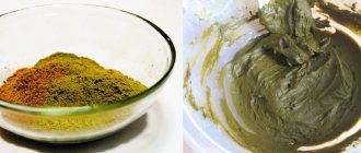
This dark shade of beige gets its name from the color of coffee with milk and thick foam - cappuccino. The color itself may differ in tone - be slightly yellowish, or, on the contrary, appear gray. The coffee shade, which is so popular in kitchen design, is neither warm nor cold. However, it has the ability to awaken the appetite; this tone is so reminiscent of coffee drinks or chocolate that it seems as if the entire kitchen is filled with an aromatic smell.
A very beautiful cappuccino color goes well with white in the kitchen
From a psychological point of view, this tone of beige does not have a negative effect on the psyche, does not cause feelings of drowsiness, irritation or sadness. In the kitchen, where cappuccino is the basis of the design, you can relax after a hard day. The color of coffee with milk always looks noble and elegant; in the photo below you can see examples of kitchen interiors in different styles.
The light coffee shade looks very cozy and fresh, without burdening the interior of the room
Important! Cappuccino visually expands the space, so to create a beautiful design for spacious rooms, it is better to combine it with dark colors to make them look more comfortable.
Coffee shades of glossy facades make the room comfortable and warm
When choosing the color of coffee with milk for your kitchen interior, you should consider a number of its features:
- The cozy shade of cappuccino lifts your spirits and also relaxes you after work;
- This color is quite popular, so finding furniture or finishing materials will not be difficult;
- Coffee with milk is quite a practical solution for walls and work surfaces; drops of water, streaks and various stains are not visible on it;
- Cappuccino looks most impressive in the classics, but does not make the kitchen interior old-fashioned; the color of coffee with milk adds a touch of modernity to a conservative design;
- Coffee is a universal choice of color, since it is combined with a large number of tones, both cold and warm, it balances overly bright colors and sets off paler tones;
- A large amount of chocolate beige will not overload the interior, unlike a number of more saturated shades.
Stylish kitchen in chocolate and coffee shades
Coffee with milk is universal and suitable for almost any kitchen interior. In addition to discreet classics, such a range would be appropriate in a kitchen in the styles of eco, Provence, country, hi-tech, minimalism, etc. All that remains is to decide on additional tones and select accessories characteristic of the chosen style.
The monochrome of the corner white-coffee kitchen can be diluted with bright decor
The set, as well as finishing materials for the kitchen in cappuccino color with or without gloss, are made from all available materials from plastic to natural wood. A variety of coffee-colored furniture models and finishes make it easy to find everything you need to create a new kitchen interior.
The glossy surface of coffee with milk helps to visually expand the kitchen space
Balayage and shatush
The most popular, along with ombre and sombre, are balayage and shatush techniques. What is their difference? Shatush is essentially a soft ombre, very smooth, gradual pearls, close to natural, while the entire length is colored.
Coloring shatush
Luxurious balayage
Balayage has a fundamental difference - individual large strands of different lengths are dyed, making the mop seem sparkling and shimmering under the sun’s rays at any time of the day. The blur-shatush technique is gaining popularity, when not one shade is used, but two, for example, level 8 cappuccino and light ash blonde level 9.
Advice! Give preference to the most natural effects - this is now a current trend.
What else is worth remembering
As already mentioned, none of the cappuccino shade options tolerate split ends. They develop a painful appearance very quickly, especially if it was cappuccino ammonia paint.
Looks best on slightly wavy, curly hair.
If coloring takes place in a salon, it would not be amiss to use the so-called. 3D coloring, i.e. adding a few more highlights that are similar in tone. Both lighter and darker than the main one.
These techniques add naturalness and also mask hair that is not too thick. This also includes the most popular coloring techniques such as ombre, shatush, and bronzing.
Contrasting ombre with coffee nuance
Do you want to look as amazing as Kim Kardashian, Katy Perry or Jessica Biel? Then your choice is cappuccino ombre with a contrasting transition from dark coffee colors to light delicate “foam” - everything we love.
- Supra powder, mixed with water and an oxidizing agent in the required proportion, lightens the lower third of the curls. Using a comb, the bleaching mixture is evenly distributed over the second third. After 50 minutes, you should treat your mane with shampoo to stop the effect of the aggressive mixture.
Ombre with coffee shimmer
- Take any color cream of the declared type, preferably from the luxury segment. It is distributed over the entire length, wait 30–45 minutes (depending on the initial data and the desired result), rinse with plenty of water, apply a balm and a plex mask.
- The mane is carefully squeezed out of the water, dried with a towel and a hairdryer. A small amount of balm or oil, for example GlissKur, is evenly applied over the entire surface.
- Voila - now you are not inferior to Hollywood stars in your charm!
Attention! If you are not confident in your abilities, then it is better to choose a suitable specialist in the salon.
Household appliances and kitchen: color solutions
When creating the design of your cooking room, you should not purchase things randomly, on the fly.
Even if you liked a certain piece of furniture, remember it and buy the same or similar one later. Precisely, determining its place in relation to all other household utensils.
As a rule, in the kitchen, in addition to the set itself, there are also household appliances: a refrigerator, washing machine, bread machine, dishwasher, gas or electric stove.
Household items in white and metallic (gray) colors equally perfectly complement a kitchen in light colors.
Correction of unwanted low tide
Have you ever had problems with yellowness, redness or redness when dyeing? Or maybe even green strands appeared? This confusion has a completely logical explanation. By making changes in appearance, we remove the natural pigment - a combination of eu-melanins (blue and red) and pheo-melanins (red and yellow) - and create the so-called background. When transitioning to chestnut, it will be ruby or orange in color, and in our case, light reddish. If all color rules are followed, redness should not appear, but what to do if the toning turns out to be uneven in color? Professional proofreaders will come to the rescue. They are produced by “Kapus”, “Estelle”, “Vella”, “Igora” and others. The purpose of the cream is to remove unwanted pigment and highlight the main one.
To get the perfect look, you need to follow all the rules of coloring.
Varieties:
- Ash (ash) – will remove yellowness and redness;
- Red (red) – neutralizes greens;
- Blue (blue or cyan) - also fights yellow spots;
- Green is the most complex corrector, it removes redness, but if you overdose there is a risk of darkening it.
Advice! The miracle remedy is added according to the “rule of 10”: 1 cm at level 10, 2 cm at level 9, and so on. But don’t overdo it, otherwise you might get too dark.
If the result does not meet expectations, use tinting agents
feel the difference
Having taken a sip from each cup, you will immediately understand that these are different coffee pleasures. In one, the taste of natural coffee is felt brighter, in the other, the coffee bitterness is masked by the creamy tenderness of milk. The milk cap in the cup on the right is noticeably denser and more voluminous, while in the left it is airier and lighter.
The difference in the names of the drinks is even more noticeable. One of them is called cappuccino, and the other is called latte. They are united by their common place of birth and composition of ingredients. And, of course, delicious taste! So that next time you don’t get lost “in two cups,” I’ll tell you the differences between latte and cappuccino.